Analytics
Understand what your community is doing, where it is growing, and who is driving it - all from a single admin dashboard.
PRO - This feature requires Jetonomy Pro.

What You Will Learn
- How to access the Analytics dashboard
- Which metrics are tracked and what they mean
- How to use the date range filter
- How to export data as CSV
Why Analytics Matter
You cannot grow what you cannot measure. The Analytics dashboard turns raw community activity into actionable metrics - so you know which spaces need attention, who your power users are, and whether engagement is trending up or down before it becomes a problem.
Enabling Analytics
- Go to Jetonomy → Extensions in your WordPress admin.
- Find Analytics and click Enable.
- An Analytics item appears under the Jetonomy admin menu.
Analytics begin recording from the moment you enable the extension. Historical data before activation is not backfilled.
Navigating the Dashboard
Go to Jetonomy → Analytics. The dashboard opens on the last 30 days by default.
Date Range Filter
Use the date range picker at the top right to select any custom range. Preset shortcuts:
- Last 7 days
- Last 30 days
- Last 90 days
- This month
- Last month
All charts and tables update instantly when you change the range.
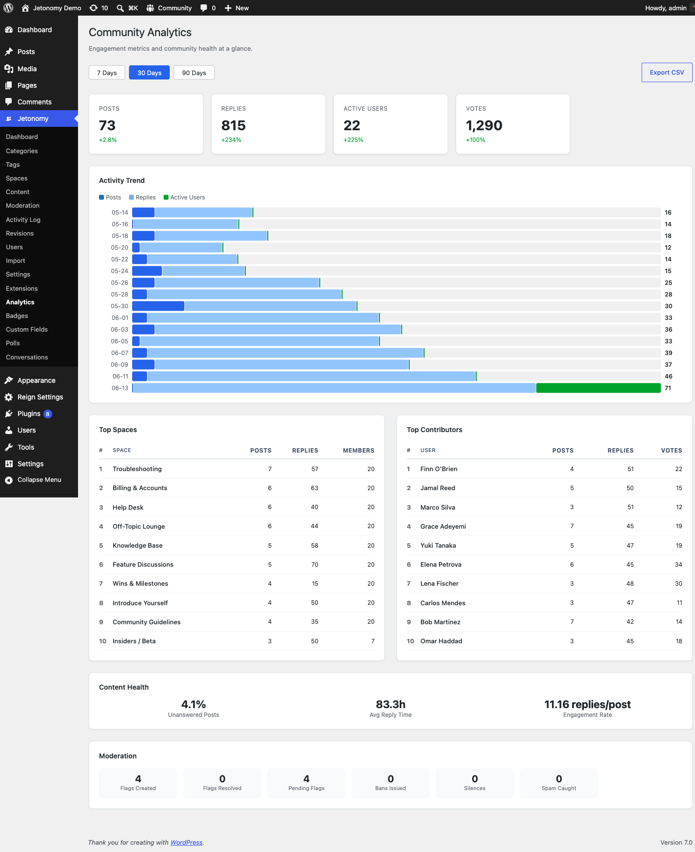
Overview Metrics
The top row shows four headline numbers for your selected range:
| Metric | What it means |
|---|---|
| Total Posts | New topics created in the period |
| Total Replies | New replies created in the period |
| Active Members | Unique members who posted, replied, or voted |
| Growth Rate | Percentage change vs the previous equal-length period |
Below the headline row, a line chart shows daily post and reply volume over the selected range. Spikes are easy to spot - hover any point to see the exact date and count.
Counting semantics (improved in 1.5.0): the daily totals count published content and stay accurate through the whole content lifecycle. A post created as pending counts on the day it was created once a moderator approves it; trashing a published post removes it from its original day's total (never producing negative days); restoring adds it back. Earlier versions counted at creation only, so moderated or trashed content slowly drifted the totals.
Top Spaces
A ranked table shows your most active spaces sorted by total posts + replies in the period. Columns include post count, reply count, unique contributors, and engagement rate (replies per post).
Use this view to find spaces that are thriving - and spaces that have gone quiet and may need a prompt or a featured topic.
Top Contributors
A ranked table of your most active members sorted by total contributions (posts + replies + accepted answers). Each row shows the member's avatar, display name, trust level, and contribution breakdown.
Tip: Use this list to identify members to invite into a moderator role, feature in a community spotlight, or send a personal thank-you.
Engagement Metrics
The engagement section shows:
| Metric | What it means |
|---|---|
| Avg. replies per post | How much discussion each new topic generates |
| Vote activity | Total upvotes and downvotes cast |
| Accepted answers | Q&A spaces only - rate of questions getting resolved |
| New member joins | Community growth over the period |
Moderation Stats
The moderation section shows flagged content volume, auto-moderation rule triggers (if Advanced Moderation is enabled), and moderator response time. A high flag volume combined with slow response time signals you need more moderators.
CSV Export
Click Export CSV in the top right of any table to download a full data export for the current date range. Exports include all rows - not just the visible page.
Exported files are compatible with Excel, Google Sheets, and any BI tool. Column headers match the on-screen labels exactly.
Dual-Path Aggregator (1.4.1, observation only)
In 1.4.1 a second analytics path runs quietly alongside the existing direct-query reader. It's an event-driven aggregator that writes to a new internal table (jt_pro_analytics_aggregate) on every relevant community event, instead of querying core tables every time the dashboard loads.
The aggregator is in a 7-day observation window. Your dashboards still read from the original direct-query path in 1.4.1 - there is no public-facing behaviour change yet. The point of the observation window is to verify that the two paths agree before flipping the default.
Verify Dual-Path admin toggle
Go to Jetonomy → Analytics. The Pro Analytics page now has a Verify dual-path toggle. Turn it on and every metric on the page is shown twice - once from the direct-query reader, once from the aggregator - with a drift percentage between them. Use this if you want to spot-check the aggregator's accuracy before we promote it to default.
GET /jetonomy/v1/analytics/diff-report
For programmatic comparison, the same data is available at:
GET /wp-json/jetonomy/v1/analytics/diff-report?range=30d

{
  "range": "30d",
  "metrics": [
    { "key": "total_posts", "direct": 1284, "aggregated": 1284, "drift_pct": 0 },
    { "key": "active_members", "direct": 312, "aggregated": 311, "drift_pct": -0.32 }
  ]
}
Helpful if you want to ship a custom monitoring panel during the observation window.
What's Next?
Reduce your moderation workload by automating common moderation decisions.