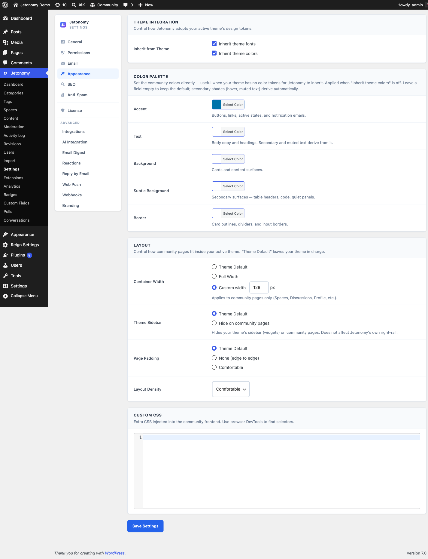
Appearance
The Appearance settings tab gives you direct control over the visual style of your community - from a single accent color override to a full custom CSS field.
What You Will Learn
- How to set a custom accent color
- What the font and color inheritance toggles do
- How layout density affects the community UI
- How to use the custom CSS field safely
Go to Jetonomy → Settings → Appearance to access these settings.
How Jetonomy's Visual System Works
Jetonomy uses CSS custom properties (--jt-* tokens) throughout its stylesheet. Every color, font, radius, and spacing value references a token. By default, those tokens inherit from your active theme's theme.json values automatically.
The Appearance tab gives you a set of override controls on top of that inheritance layer. You can use them without writing any CSS.
Accent Color
Setting: accent_color
Default: #0073aa shown in the picker; the live community inherits your theme's primary color while Inherit Colors from Theme is on
Location: Appearance tab → Colors section
The accent color drives buttons, links, vote arrows, trust-level highlights, and other interactive elements.
When you first open the picker it shows a blue value (#0073aa). Do not be alarmed - while Inherit Colors from Theme (below) is on, that stored value is ignored and the live community pulls its accent from your theme's primary color (--wp--preset--color--primary). The picker value only takes effect once you turn Inherit Colors off, at which point it is injected as --jt-accent on the .jt-app element and overrides the theme.
To set a custom accent: turn Inherit Colors from Theme off, then pick your color here.
Tip: Use a color that has at least a 4.5:1 contrast ratio against white (WCAG AA). The community UI places accent colors on white backgrounds frequently.
Inherit Fonts from Theme
Setting: inherit_fonts
Default: On
Location: Appearance tab → Typography section
When on, Jetonomy uses --jt-font: inherit - the community adopts whatever font your theme sets on the body element. This is the correct setting for most sites.
Turn this off only if you want Jetonomy to use a specific font independent of your theme. In that case, define --jt-font in the Custom CSS field.
Inherit Colors from Theme
Setting: inherit_colors
Default: On
Location: Appearance tab → Colors section
When on, the --jt-accent token pulls from --wp--preset--color--primary in your theme.json. This means the accent color stays in sync with theme updates automatically.
Turn this off if you have set a custom accent color above and do not want theme updates to override it.
Color Palette
Location: Appearance tab → Color Palette section
Beyond the accent color, you can set the community's core surface colors directly. This is useful when your theme has no color tokens for Jetonomy to inherit. These overrides apply when Inherit Colors from Theme is off. Leave any field empty to keep the default - secondary shades (hover, muted text) derive automatically.
Each field accepts a hex color value:
- Text (
text_color) - Body copy and headings. Secondary and muted text derive from it. - Background (
bg_color) - Cards and content surfaces. - Subtle Background (
bg_subtle_color) - Secondary surfaces such as table headers, code, and quiet panels. - Border (
border_color) - Card outlines, dividers, and input borders.
Layout
Jetonomy 1.4.0 added a Layout panel with three controls that decide how the community canvas sits inside your active theme. Every option defaults to Theme Default, so existing installs see no visual change after the upgrade. When you do change a value, Jetonomy emits a small block of CSS scoped to body.jt-page - the rules only apply on community routes and never leak into the rest of your site.
Container Width
Setting: container_width
Default: Theme Default
Options: Theme Default, Full Width, Custom (px)
Location: Appearance tab → Layout section
Controls how wide the community canvas can grow before it stops expanding.
- Theme Default - Inherits the host theme's content container width. Use this when your theme's reading width already feels right.
- Full Width - Lets the community stretch edge-to-edge of the viewport. Best for kanban-style spaces, leaderboards, and dense feeds that benefit from horizontal room.
- Custom (px) - Pins the canvas to a specific pixel width (e.g.
1280). Useful when you want a wider reading column than the theme provides without going fully edge-to-edge.
Theme Sidebar
Setting: sidebar_visibility
Default: Theme Default
Options: Theme Default, Hide on community pages
Location: Appearance tab → Layout section
Decides whether the host theme's sidebar shows on community routes.
- Theme Default - Leaves the theme's sidebar exactly where the theme renders it.
- Hide on community pages - Suppresses the host theme's sidebar across
/community/*so the forum renders at full width even when the rest of the site has a sidebar everywhere. Pair this with Full Width above when you want a true full-bleed community experience.
Page Padding
Setting: padding_preset
Default: Theme Default
Options: Theme Default, None, Comfortable
Location: Appearance tab → Layout section
Adjusts the inline padding around the community canvas.
- Theme Default - Uses whatever inline padding the theme provides.
- None - Removes the inline padding so the community sits flush against the viewport edges. Good for themes that already hug the edges.
- Comfortable - Adds a generous inline padding. Useful for themes that hug the edges too tightly and leave content butting against the screen on mobile.
Tip: If your theme has a sidebar everywhere but you want the community to feel like a standalone app, set Container Width to Full Width, Theme Sidebar to Hide on community pages, and Page Padding to Comfortable. The rest of your site keeps the original theme layout.
Layout Density
Setting: layout_density
Default: comfortable
Options: Compact, Comfortable, Spacious
Location: Appearance tab → Layout section
Compact - Reduced padding and tighter spacing. Fits more content on screen at once. Best for high-volume spaces where members scan many posts quickly.
Comfortable - Standard spacing between post cards, reply cards, and interface elements. Best for general communities and long-form discussion.
Spacious - Extra-roomy spacing between cards and interface elements. Best for low-volume, reading-focused communities that favor breathing room over density.
When you change this setting, Jetonomy adds data-jt-density="compact" (or "comfortable") to the .jt-app wrapper element. CSS rules keyed to this attribute apply the appropriate spacing.
Custom CSS
Setting: custom_css
Default: Empty
Location: Appearance tab → Custom CSS section
The Custom CSS field accepts any valid CSS. Jetonomy outputs this CSS as an inline style block at the end of the <head> on all community pages, scoped after the main jetonomy.css stylesheet.
Use this field to override --jt-* tokens, adjust component styles, or add community-specific visual tweaks:
/* Override accent color and border radius */
.jt-app {
    --jt-accent: #7c3aed;
    --jt-radius: 12px;
}

/* Increase heading size in post titles */
.jt-post-title {
    font-size: 1.25rem;
}
Note: Custom CSS is output as-is - no minification, no scoping, no sandboxing. Write only CSS you control. If you enter invalid CSS here, it may break parts of the community UI.
Tip: For larger CSS customizations, consider using a child theme's
style.cssor a dedicated CSS plugin instead of this field. The Custom CSS field is best for quick, targeted overrides.
What's Next?
Configure how Jetonomy appears in search engines - XML sitemaps, schema markup, and meta title patterns.