Modals and Confirmations
Jetonomy 1.4.0 introduced an in-product modal toolkit that replaces the native browser confirm, alert, and prompt dialogs across the community. Native browser dialogs look like operating system pop-ups, cannot be themed, and don't follow modern accessibility patterns. The Jetonomy modals are themed, keyboard-accessible, and localised. The 1.4.2 retag completed full translation coverage for the button labels.
What You Will Learn
- What the modal toolkit replaces and why
- Where you'll see Jetonomy modals in the community
- How the modals handle accessibility and keyboard navigation
- How button labels translate for non-English sites
- How dark mode and theme colors are picked up automatically
- How to override the modal styling in your theme
What the Toolkit Replaces
JavaScript has three built-in dialog functions:
window.confirm("Are you sure?")returns true / falsewindow.alert("Done.")shows an info messagewindow.prompt("Reason?")asks for a text input
These look like system pop-ups. They sit outside your theme, look different on every operating system and browser, can't be styled, and don't return focus to the right element when dismissed. Screen readers treat them inconsistently, and keyboard navigation is at the mercy of the browser.
Jetonomy now uses its own modal toolkit for every "Are you sure?" prompt across the plugin. The modals look like your community, behave consistently, and play nicely with screen readers and keyboards.
Where You'll See Jetonomy Modals
Anywhere the community needs to confirm an action or collect a short answer:
| Action | Modal type |
|---|---|
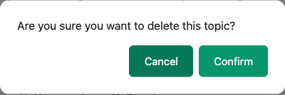
| Delete a post or reply | Confirm |
| Remove a flag without taking action | Confirm |
| Ban or silence a member | Prompt (asks for duration / reason) |
| Lift a ban | Confirm |
| Move a topic to another space | Prompt (asks for target space) |
| Split a reply into a new topic | Prompt (asks for new topic title) |
| Pin or unpin a topic | Confirm |
| Mark all notifications read | Confirm |
| Trash a category | Confirm |
| Approve or reject pending content | Confirm |
| Cancel an unsaved edit | Confirm |
The pattern is consistent: destructive actions always require a confirmation, prompts that need an answer always show a clear input field with sensible defaults.
Modal Types
The toolkit exposes three modal types:
- Confirm - two buttons (Cancel / Confirm). For yes/no decisions
- Alert - one button (OK). For one-way info or success messages
- Prompt - text input plus two buttons (Cancel / Submit). For collecting a short answer
Each type uses the same overlay and box, so the visual style is uniform across the community.
Accessibility
The toolkit is built to WCAG 2.1 AA. Every detail that screen reader users and keyboard users rely on is wired up:
| Feature | Behaviour |
|---|---|
| Keyboard open | Focus moves to the first focusable element in the modal |
| Tab cycling | Focus stays trapped inside the modal until it closes |
| Escape key | Dismisses the modal, equivalent to clicking Cancel |
aria-labelledby |
Points to the modal title element |
aria-describedby |
Points to the modal body text |
role="dialog" |
Set on the modal box |
aria-modal="true" |
Tells assistive tech the rest of the page is inert |
| Focus return | When the modal closes, focus returns to the element that opened it |
| Overlay click | Closes the modal (configurable, off for destructive prompts) |
Screen reader users hear the modal title and body when it opens. Keyboard users can tab through the controls without escaping the dialog. Mouse users can dismiss by clicking the overlay, except on destructive prompts where overlay dismiss is intentionally disabled to prevent accidental data loss.
Reduced Motion
If the visitor's operating system has "Reduce motion" enabled, the modal skips its slide-in and fade animations. The dialog still opens and closes; it just appears and disappears instead of animating. This respects vestibular accessibility preferences without compromising functionality.
Localisation
All button labels translate through the standard WordPress translation pipeline:
| English label | Used in |
|---|---|
| Cancel | Every modal |
| Confirm | Confirm modals |
| OK | Alert modals |
| Submit | Prompt modals |
Modal titles and body text are localised by the calling code (e.g. "Delete this post?" is translated by the delete action that opens the modal). The toolkit itself only contributes the four button labels above.
The 1.4.2 retag completed full translation coverage for every label. Before that retag, English fallbacks could leak into translated locales for one or two of the buttons. Sites running a translated locale (French, German, Spanish, Arabic, etc.) now see fully translated buttons everywhere.
Dark Mode
The modal box and overlay both use Jetonomy design tokens. That means:
- Dark theme active → modal renders dark automatically
- Light theme active → modal renders light
- Theme brand color → primary button picks it up
- Theme border radius → modal corners match
No per-theme configuration required. If your theme defines a custom --jt-bg or --jt-accent, the modal picks it up.
Styling Override
Site owners who want a custom look can override the modal styles in their theme stylesheet. The relevant classes are:
| Class | Element |
|---|---|
.jt-modal-overlay |
The backdrop behind the modal |
.jt-modal-box |
The modal container |
.jt-modal-title |
The title heading inside the modal |
.jt-modal-body |
The body text or prompt input wrapper |
.jt-modal-actions |
The button row at the bottom |
.jt-modal-button |
Both buttons (Cancel / Confirm) |
.jt-modal-button--primary |
The primary (right-hand) button |
.jt-modal-button--secondary |
The Cancel (left-hand) button |
Example: dimming the overlay further for a more cinematic feel.
.jt-modal-overlay {
  background: rgba(0, 0, 0, 0.7);
}
Example: making the modal a bit wider on desktop.
@media (min-width: 768px) {
  .jt-modal-box {
    max-width: 560px;
  }
}
We recommend overriding tokens (e.g. --jt-bg, --jt-radius) at the modal level rather than rewriting properties directly, so dark mode and theme switching keep working.
Developer Note
The toolkit exposes three global functions for any custom JavaScript that integrates with Jetonomy. Each returns a Promise.
The message is always the first argument; an options object follows.
// Yes/no confirmation
const confirmed = await window.jetonomyConfirm( 'This cannot be undone.', {
  title: 'Delete this post?',
  confirmLabel: 'Delete',
  danger: true,
} );

// One-button info dialog
await window.jetonomyAlert( 'Your changes are live.', {
  title: 'Saved',
} );

// Text input prompt
const reason = await window.jetonomyPrompt( 'Tell our moderators what is wrong.', {
  title: 'Why are you reporting this?',
  placeholder: 'Reason',
} );
The danger: true flag styles the confirm button in red and disables overlay-click dismiss. Useful for delete confirmations and account actions.
These are pure JS globals; you don't need to import anything if jetonomy is already enqueued on the page.
What's Next?
Learn how the activity log tracks every audit-worthy event in your community.