← All features

Analytics Pro

Know what your community is doing

Engagement trends, top contributors, and growth over any date range, all from one admin dashboard. See which spaces are thriving and who is really carrying the conversation.

Read the full analytics guide →

The Jetonomy Pro analytics dashboard with engagement charts and a ranked top-contributor table

The problem

You cannot tell if your community is growing or quietly dying. Without data, you are guessing about what is working and reacting to problems after they have already cost you members.

  • Headline metrics for any range: total posts, total replies, active members, and growth rate
  • Daily post and reply volume on a line chart, so spikes and slumps are obvious at a glance
  • Top Spaces and Top Contributors tables to find what is thriving and who to thank
  • Engagement and moderation metrics, from replies per post to flag volume and response time
  • Custom date ranges with presets, plus CSV export of every row for Excel, Sheets, or any BI tool

One dashboard for the whole community

You cannot grow what you cannot measure. The analytics dashboard turns raw community activity into metrics you can act on, so you know which spaces need attention, who your power users are, and whether engagement is trending up or down before it becomes a problem.

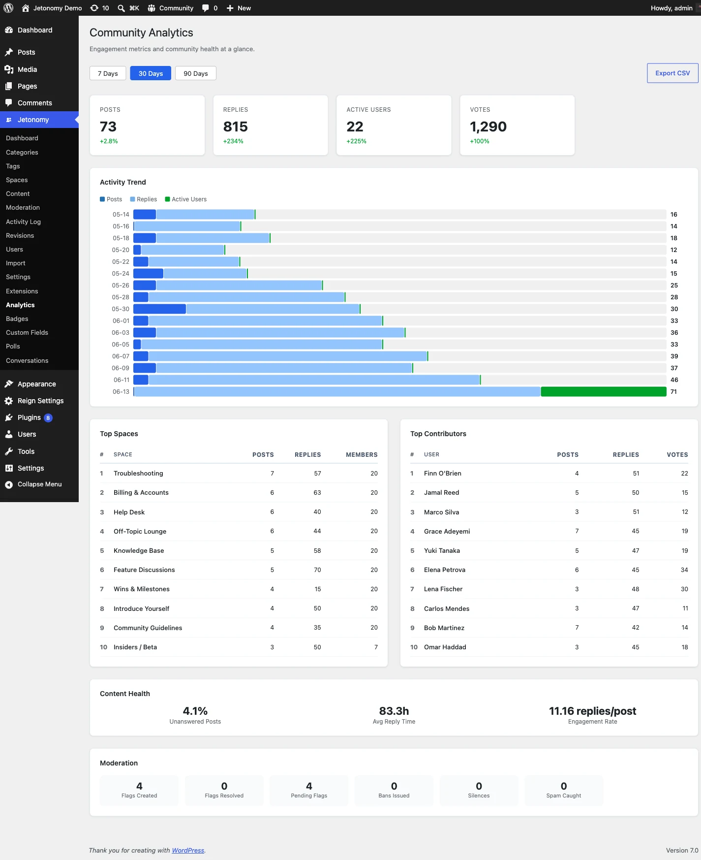
The top row gives you four headline numbers for whatever range you pick: total posts, total replies, active members, and a growth rate compared to the previous period of the same length. Below them, a line chart plots daily post and reply volume so a spike after a launch or a slump over a quiet month is obvious at a glance. Hover any point for the exact date and count.

The whole dashboard reads from your own database. There is no third-party tracker, no script loaded on your members, and no data shipped off to an external analytics service.

Find what is thriving and who is driving it

Two ranked tables turn the numbers into decisions. Top Spaces sorts your spaces by total activity and shows post count, reply count, unique contributors, and engagement rate, so you can spot the spaces that are thriving and the ones that have gone quiet and need a prompt.

Top Contributors ranks your most active members by total contributions, with avatar, display name, trust level, and a breakdown. Use it to find the members worth inviting into a moderator role, featuring in a spotlight, or simply thanking. An engagement section adds replies per post, vote activity, accepted-answer rate for Q&A spaces, and new member joins, while a moderation section surfaces flag volume and moderator response time.

Pick a range, export the rows

The dashboard opens on the last 30 days, and a date-range picker lets you choose any window. Presets cover last 7, 30, and 90 days, this month, and last month, and the whole page updates the moment you change the range.

When you need the raw data, every table has an Export CSV button. It downloads all rows for the current range, not just the page on screen, with headers that match the on-screen labels exactly. The files open cleanly in Excel, Google Sheets, or any BI tool, so building a board report or a custom chart takes minutes.

Who it's for

Community managers

Spot a quiet space before it dies and find power users worth promoting to moderator.

Owners reporting to a team

Export clean CSV for any range and show growth in numbers, not anecdotes.

Course and membership creators

See whether each cohort is engaging and which topics generate real discussion.

Common questions

What metrics does the dashboard track?

Headline numbers cover total posts, total replies, active members, and growth rate versus the previous equal-length period. Below that you get daily volume charts, a Top Spaces table, a Top Contributors table, engagement metrics like replies per post and vote activity, and moderation stats such as flag volume and response time.

Can I look at a specific time period?

Yes. The dashboard opens on the last 30 days and a date-range picker lets you choose any custom range, with presets for last 7, 30, and 90 days, this month, and last month. Every chart and table updates instantly when you change the range.

Can I get the data out of WordPress?

Yes. Any table has an Export CSV button that downloads every row for the current date range, not just the visible page. Column headers match the on-screen labels, so the files drop straight into Excel, Google Sheets, or a BI tool.

Does it require Pro, and is old data included?

Analytics is a Jetonomy Pro feature. Recording begins the moment you enable the extension. Activity from before activation is not backfilled, so the sooner you turn it on, the longer your history.

Run it on your own WordPress.

Download the free plugin, run the 5-minute wizard, and turn this feature on. No SaaS rent, your data, your domain.